IOM Emergency Navigator

Transforming a Document into an Interactive Website

Customised Dashboards

Client

IOM DHRR

Timeline

Jan'26 - Apr'26

Revisual Labs created a website to serve as a step-by-step guide for IM staff on roles, responsibilities, and best practices for information management across all phases of emergency response deployments.

Image with three screens from the website- a swimlane for navigation, glossary page and quiz page
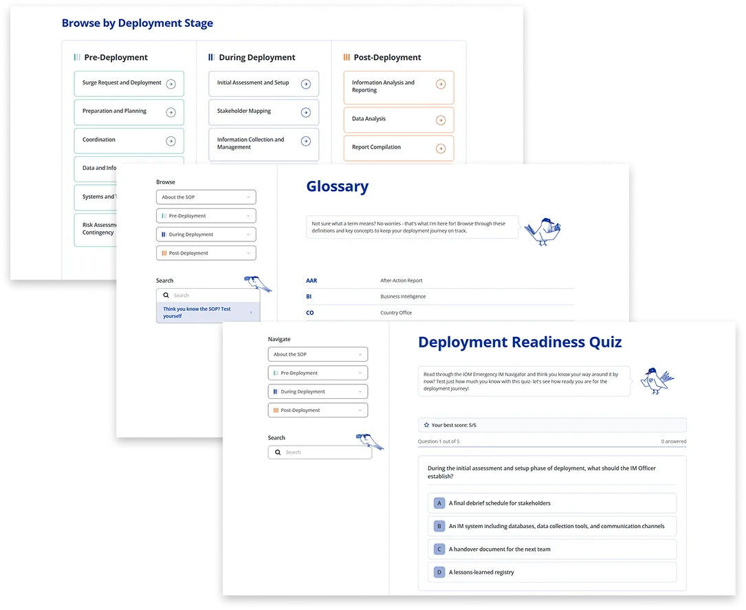
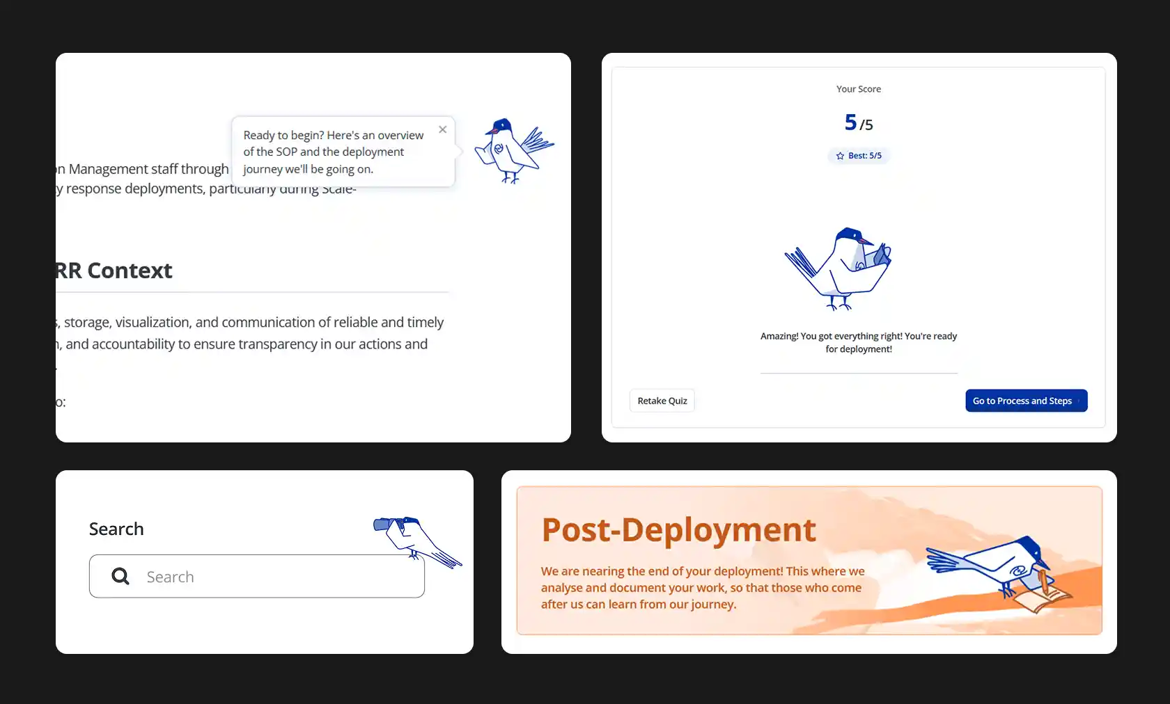
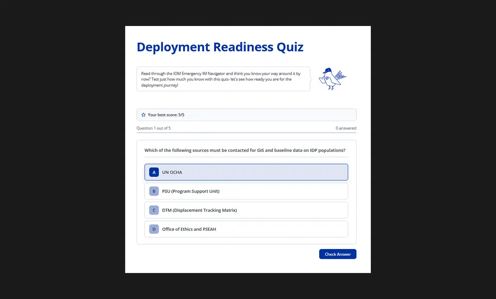
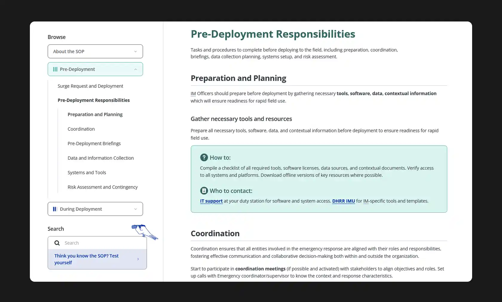
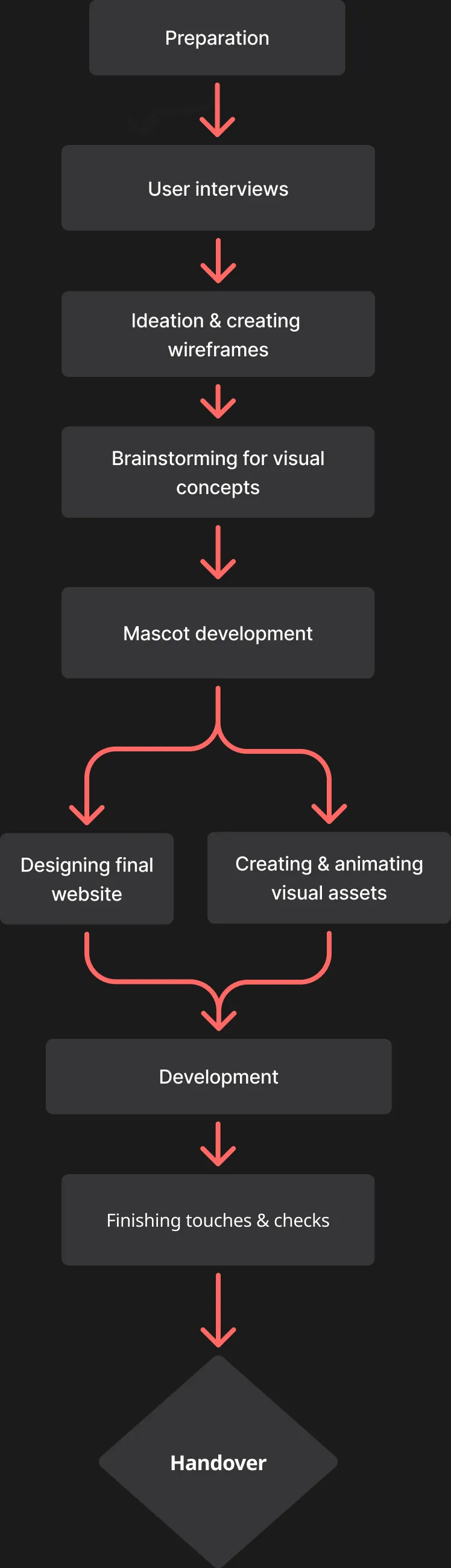
IOM DHRR uses a SOP document that helps guide field personnel on what to do, where to go, and whom to meet during deployment. But they have never had a consolidated, global format that Information Management specialists, as well as other users, could refer to. They thus commissioned RVL to create an interactive website that would contain this SOP document in a user-friendly format, making it easier for users to go through, while also being easily accessible.
The project consisted of transforming the SOP document into an interactive website which would encourage people to become familiar with its contents. As this would be a document that would be accessed frequently during the deployment cycle, as well as in a variety of situations and devices, it needed to be intuitive, field-friendly and interesting enough that users would browse through it in their free time as well. The end result was a simple yet visually engaging website, with several features:
The bird character in different parts of the website- giving tips, talking to the user, introducing sections

A bird guide

We created a bird character to guide the user though the website — it introduced sections, gave tips wherever needed, and provided visual breaks between the text content of the SOP. The bird was inspired by the arctic tern, which has the longest migratory journey in the animal kingdom — thus making it a fitting guide for users who were going on their own deployment journeys.

Deployment Readiness Quiz

We also made a quiz section as an interactive way of testing the user's knowledge of the SOP. A random list of 5 questions are presented each time, and upon getting a right or wrong answer, further context to the answer is provided as well as a link to where that information is present in the SOP text. This helps provide a way for users to confirm their familiarity with the contents, and also an alternative way to learn certain important facts.

Quiz screen with the bird character on top introducing the quiz, followed by a single-choice question below it
Screenshot showing wiki-style layout of the main contents of the section page

A wiki-style layout

For the page with information about the deployment stages, we created a simple wiki-style layout with an easily navigable menu on the left that allowed users to find what they needed to on the page. Animated banners and a brief introduction to each section divided the page into the three stages of deployment, and with each stage also having a different colour scheme, this ensured that users could quickly recognise which section they were in while scrolling. Links to contact information for important organisations and personnel under 'Who to contact', as well as hover interactions for certain abbreviations in the text which opened popups with full forms meant that users would be able to directly access and understand what they needed to from this page.

Process
A flow chart of our process in developing the website
Tools
Design
Figma
Development
Claude, Netlify
Project Team

Swathi Singh

Project Manager

Ipshita Raj

Designer & Illustrator

Manas Sharma

Developer

PLACEHOLDER TO PREVENT ISSUES WITH CONTACT LINK